")
iWorks Logo & Brand Design
How I Designed the iWorks Logo Design and Brand System as a CMC Integrated Media Senior
This branding case study walks through how our student‑run agency, iWorks, moved from early logo ideas to a final logo and brand system that supports our “Power On” campaign at Colorado Mountain College. As a senior in the Integrated Media Bachelor’s Program at CMC, this project gave me real‑world experience designing for a student‑powered creative agency and building a brand that will live on beyond my time here.news.tcnj+4
Starting with a student‑run agency
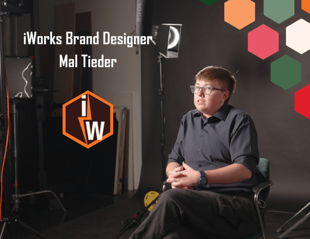
This year, I’ve gotten to do something I’ve wanted to do for a long time: build a brand from the ground up. As a senior in the Integrated Media Bachelor’s Program at CMC, I’ve been designing and developing the iWorks branding system, which includes our logo, colors, typography, and a full brand book.
I’ve always loved building brands that represent the people behind them, building on the story they already have instead of trying to force something new just because it looks cool. With iWorks, that part came naturally. I’m part of the agency I’m designing for, so I already know what we stand for, how we work together, and what types of creatives we are. I’m not designing for a mystery client. I’m designing for my team and helping build a legacy that will live at CMC long after I graduate.
From team ideas to logo concepts
The first step was landing on a logo concept. Our whole team came up with different ideas, and then we narrowed them down to our top three.
From those three, I designed three new concepts that pulled together the elements everyone liked most. It was a lot of combining, simplifying, and trying to keep what felt like “us” while letting go of what didn’t.
Here is a link for logo design processes. We used many different creative brainstorming processes to find our logo, but this article helps to break the process down into clear steps—from research to concepting to refinement. It can be a really helpful reference alongside projects like this one.
Testing colors, shape, and the “Power On” lightning bolt
Once we finally chose one direction, the real work started. With a final concept to focus on, it was time to see how the logo would work in context, not just floating on a white background.
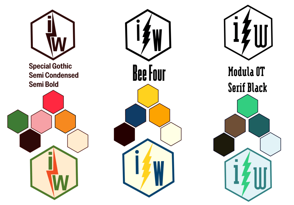
To test it out, I created three versions of the logo with different color palettes so the group could give feedback. Seeing the logo in different color setups helped us quickly see what felt right and what didn’t.
That process is how we ended up with the more natural color palette and the lightning bolt framing the letters. The lightning bolt added energy and a nice sense of movement, but it also gave the logo a strong shape that stands out and connects directly to our “Power On” campaign theme. It became one of those details that just made sense and stuck.
Design resources that cover color palettes, typography, and shape language in visual identity work can give more context on why choices like this help a logo feel cohesive and memorable.
Logo design process: Design → Feedback → Revise → Repeat
Once we knew what elements we wanted to keep, I shifted into refining mode. From there, it turned into a steady loop:
Design a Version → Get Feedback → Revise → Repeat
After a few rounds and a lot of small but important tweaks, we got to a logo we all agreed on. None of the changes were huge on their own, but together they made the logo cleaner, more flexible, and more “iWorks.”
Only after that point did it make sense to move on to the rest of the brand system. For me, the logo needs to feel solid before you start building everything else around it.
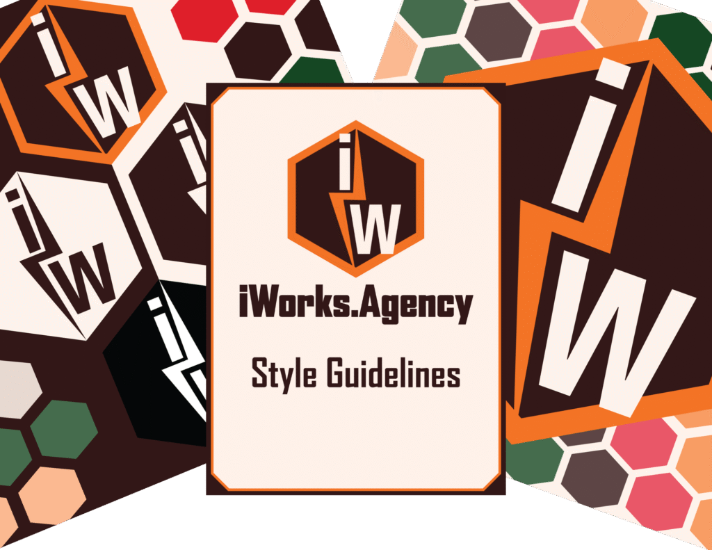
From logo to full brand system (Part 2)
In Part 2, I’ll share how that single logo turned into a full brand book, visual system, and the point-to-point hexagon that now shows up all over iWorks.
If you’re interested in how a student‑powered creative agency builds a complete brand system from a single logo, make sure to check out Part 2 when it’s live, where this iWorks branding case study continues into the full visual identity and brand book.